O'Connell More Consulting and Real Estate
Brand identity, content development, website and marketing strategy for commercial real estate management company.
Overview
In the competitive real estate market, O'Connell More Consulting & Real Estate provides a unique approach for the investment real estate client. Offering investment real estate, business sales brokerage and consulting services, O'Connell More Consulting & Real Estate's strong understanding of the Central New York area and its economic needs and trends has provided a specialized approach to strengthening clients' real estate portfolios. With nearly 2 million square feet of property sold and more than 3,000 apartment units brokered, the firm asked 76West to refresh the brand's visual identity and help propel a new strategic vision to advance the firm for the next decade, while underscoring the firm's knowledge of the market.
Services
- Brand Strategy
- Logo Design
- Brand Identity
- Content Development
- Marketing Strategy
- Responsive Website
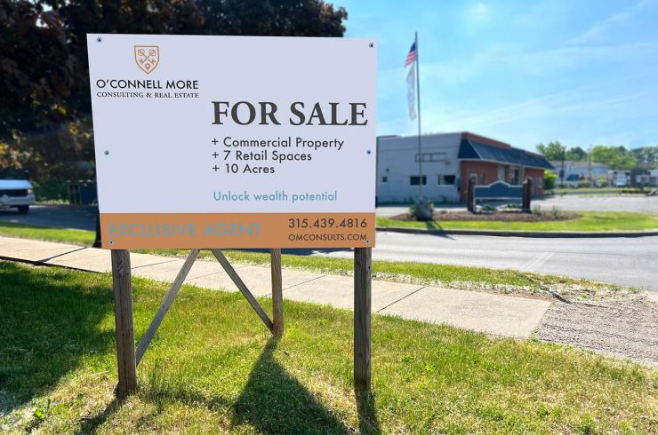
- Signage + Site Communication
Brand Identity
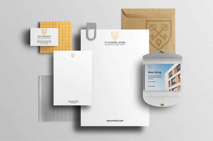
We created a brand language in which the symbol and typography creates opportunities for confident expression via a unifying brand architecture. By creating a system consisting of a shield wordmark, we bolster the strength and recognition for the brand with a renewed confidence.
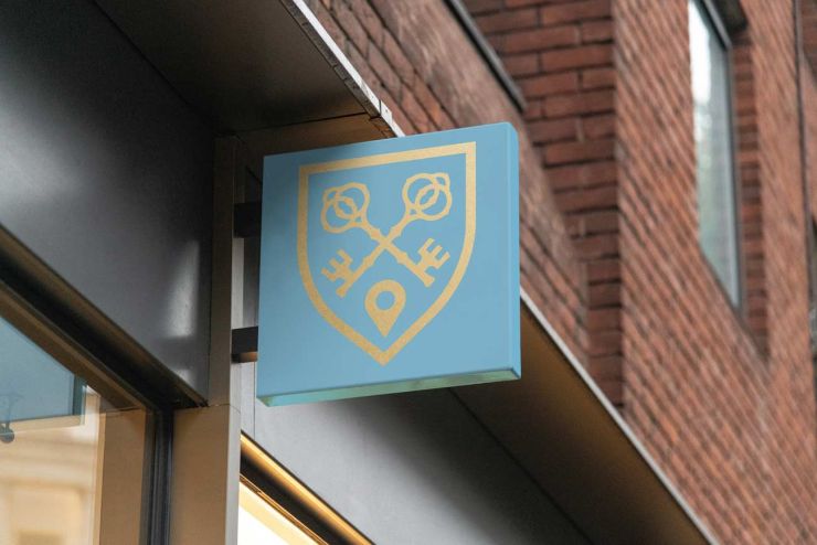
In heraldry, an escutcheon is commonly seen as the centerpiece of a crest. 76West modernized this application by using this form as a base for the mark. This classic form stands to represent the strength and success of the 30+ year career of the founder. We started with a heater style shield to frame the crest. Inside the crest we placed crossed keys atop a map pin. All the elements combine to represent ownership, location, confidence and security that O'Connell More clients gain. To bring even more meaning and a uniqueness to the the new trademark, we were able to hide an easter egg that reveals the letters "O" and "M" in the shapes of the keys.
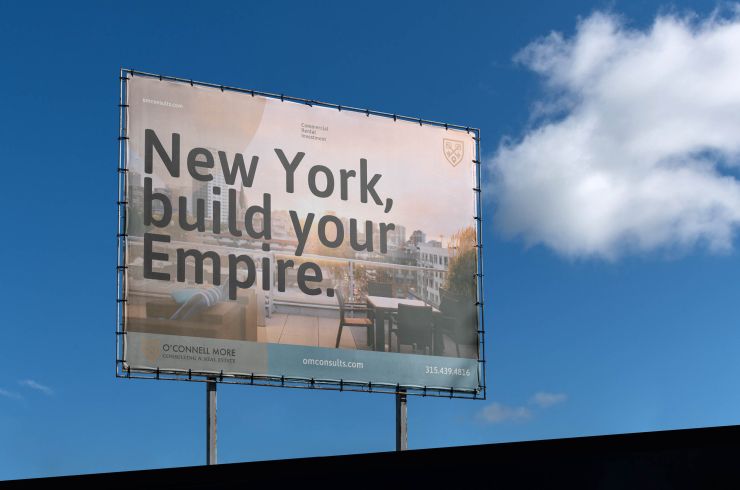
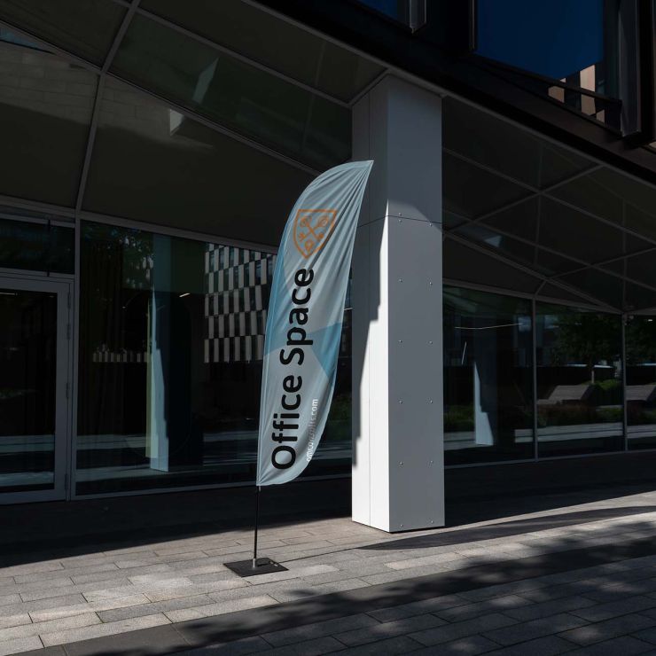
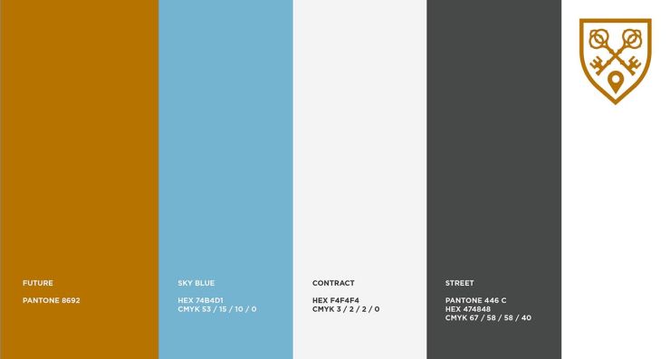
Images Below: technical rendering of logo, exterior signage application, brand color system.

Typography
We sought typography that contrasts the classic forms found in the shield logo. Because legibility at a wide range of sizes and uses was important, we needed a font that was clear. To present the brand with longevity and a fresh, clean appearance, we selected ASAP.
ASAP is a contemporary sans-serif family with subtle rounded corners. Designed by Pablo Cosgaya, ASAP started with 4 styles, grew to 8 styles: Regular, Medium, Semibold, Bold and its corresponding italics. This family, specially developed for screen and desktop use, offers a standardized character width on all styles, which means lines of text remain the same length when set at different weights. Today, ASAP has grown to more than 77 weights thanks to its open-source community of type designers.
For the O'Connell More system, we've chosen 3 weights of ASAP to represent the brand in the written word in digital applications, print and signage. The type specimen below shows the selected weights. The blue, gray and gold outlines of omc demonstrate the uniform width of the face at different weights.
Responsive Website
With internet technologies now more than 20 years old, many companies are faced with aging platforms that need updating. When O'Connell More
Consulting and Real Estate approached 76West, their web platform was not built for responsive rendering. The web property was out of date and difficult to manage or update. As one of the primary expressions of the O'Connell More brand, we created a modern, flexible web site optimized for all devices... mobile, tablet and desktop.
The website features subtle animations that create a pleasing user experience feature, and provide technical benefit for improved page-load times.
Website Before
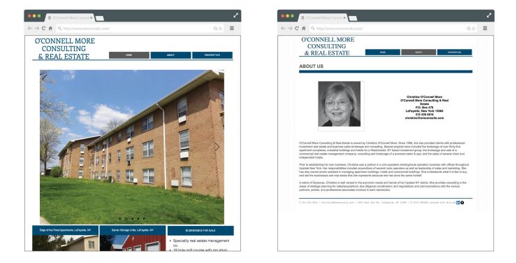
Website After

A Platform for Connection
The new website platform we built also allows the firm to connect with social media outlets and industry specific platforms such as Crexi where O'Connell More actively connects with their clients.
A system of custom icons help to provide clarity and differentiation between the firm's service offerings.

Scaleable Intent
While the brand's logo or trademark is important, a modern brand is much more than just the visual symbol. A brand is the entirety of its expression: the visual elements, the written words and the actions of the organization's staff. Each brand element was carefully designed with a specific intention and alignment to overall business goals, with a result that makes the translation of strategy to design tangible.
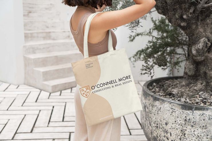
Scalability is an important factor in the application of the brand elements. Legibility and recognition across a wide range of applications was important for consistency and recognition. The team at 76West considered many end-uses across a range of materials appropriate for commercial real estate: small scale items like business cards, low-fidelity output such as garment printing and very large applications placed on property signage and buildings.

Related Work
Brand identity, content development, website and marketing strategy for commercial real estate brokerage company.
Website content development and user interface for corporate IPO.
Brand identity, content development and website redesign for mid-tier email marketing provider.
Investor and community communications materials for startup incubator focused on unmanned vehicle industry.


