BOCES
Brand strategy, identity update, brand training for a large regional education services provider.
Overview
BOCES, a leading education services provider, stands as a cornerstone institution across five counties, serving a workforce of over 500 dedicated professionals. At the heart of BOCES lies a steadfast commitment to customer service, a value ingrained in every facet of its operations. Recognizing the pivotal role of positive interactions within the organization, BOCES embarked on a transformative initiative aimed at fortifying its brand through enhanced customer experiences.
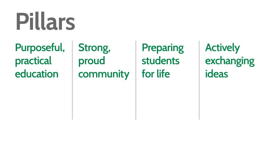
Central to this initiative was the comprehensive redefinition and realignment of customer service paradigms within BOCES, particularly as they intersect with the student journey. By prioritizing the organization’s commitment to the student experience, 76West worked with leadership to elevate service standards and foster enduring relationships dedicated to advancing educational excellence.
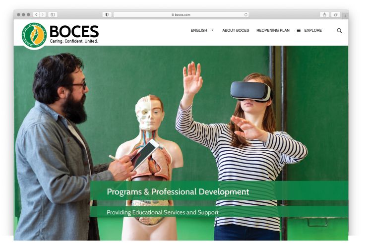
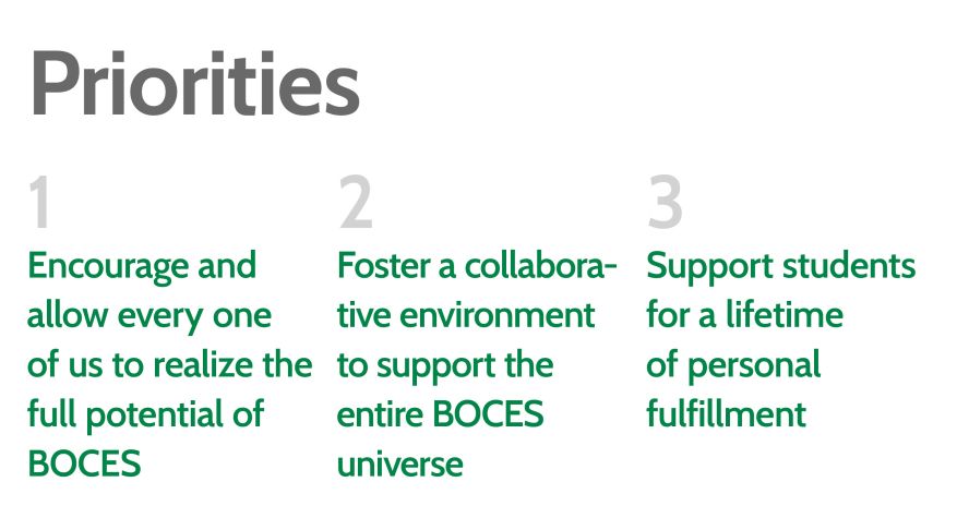
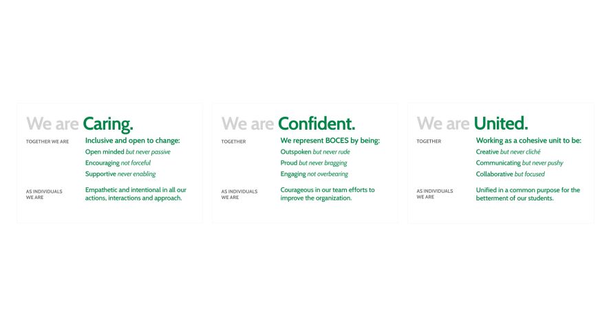
Our first phase was to conduct meticulous research, engaging both internal BOCES stakeholders and external partners. The purpose of this stage of the project was to gather information, attitudes and perceptions from the target audiences and end-users. After careful consideration and analysis, we worked with BOCES to create the new definition of the organization's personality: Caring. Confident. United.

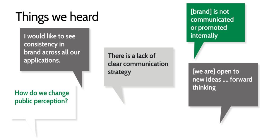
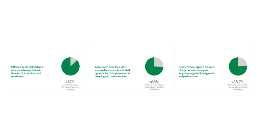
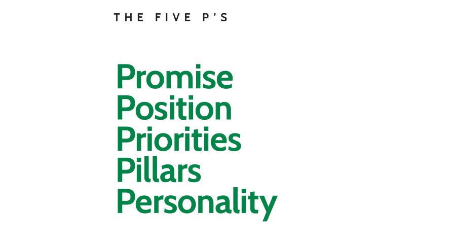

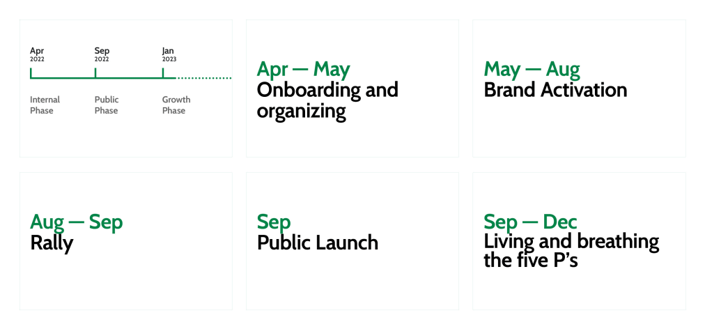
Above: Ten slides above show elements, findings and forecasting from 76West led brand strategy exercises.
Services
- Research
- Positioning
- Strategy
- Communication
- Brand Identity System
- Integration
- Brand & Systems Training
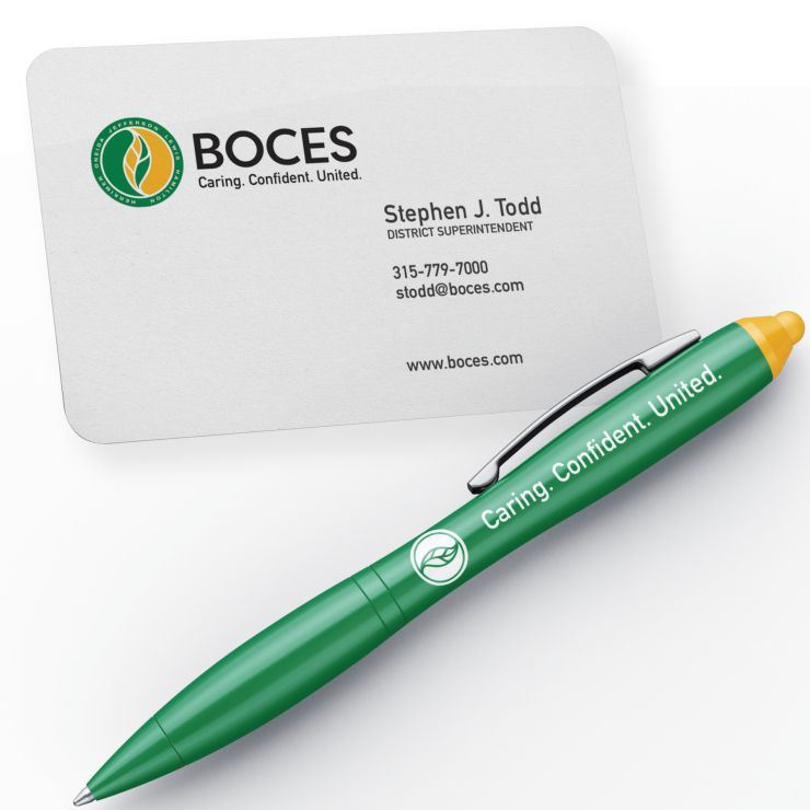
Brand Trademark
When 76West set out to create the identity system, we worked with BOCES’ team to build a presentation that felt new, while at the same time maintaining a familiarity that reinforced the heritage of BOCES. This facilitated a framework for continuity and a clear roadmap for the future.
The existing trademark had an organizational history, recognition and symbolism; all hallmarks of a strong symbol and features we wanted to build on. While the original designer of the logo is unknown, we felt a responsibility to give it a new life and provide a prescription for modern media applications.
The updated trademark sees refined typography in the roundel and in the wordmark. We combined a custom typeface with a font family that became the new written voice for BOCES and a clear way to integrate the personality with a primary lockup.
![]()
The symbolism of the existing BOCES trademark was clear and strong. A circle representing a group and the completeness of education, the balance of the ying-yang forms within the circle and the five leaf segments that are a visual metaphor for 5 county service areas were all established elements of the trademark.
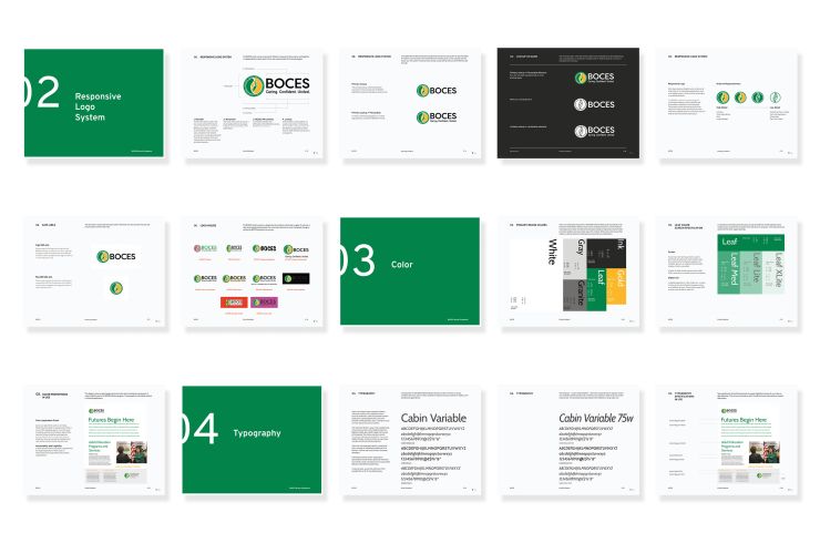
Building on this, 76West refined the drawing of the logo and the typography in the roundel which lists the 5 counties. We then created an order of responsiveness for the logo from high detail items such as signage, publications and print use — to low detail items which can include things like embroidery applications, social media avatars and other instances where a one-color mark is required.
The new brand approach we created with the team at BOCES embodies a commitment to clarity. Each brand element, including type, color and imagery, was carefully designed with a specific intention and student-centric focus in mind. With this, we created a new communication standard for use with internal and external audiences.
—Keith D'Mello, Director 76West and Strategy Lead
Brand Identity System
While embarking on a multi-year journey of BOCES’ brand evolution, at the core of our process lay a deliberate and enduring commitment to branding, infused with a design-centric ethos that permeates every asset 76West crafts.
Our approach was grounded in the establishment of trust from within and the cultivation of clarity in the organization's self-perception. Central to our mission was the delivery of a brand program characterized by confidence, modernity and adaptability. With a meticulous eye for detail, each aspect of the brand identity – from typography and color palette to imagery and graphical elements – was purposefully crafted to align seamlessly with overarching business objectives.
The result is not merely a visual identity, but a cohesive and sustainable embodiment of strategic intent through design. The systems serves to create brand consistency and equity across the organization with each of the teams and individuals actively building communication materials.
Everything, Defined
In order to encourage adoption of the new system, 76West introduced a working vocabulary for each of the functional brand elements.
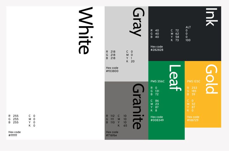
The new system uses custom named colors in the system to reinforce meaning and symbolism of the logo while drawing inspiration from the local geography and classic school functions.
These details facilitate clarity and intention with how everyone in the organization communicates when building day to day marketing initatives.

Rolling Presence
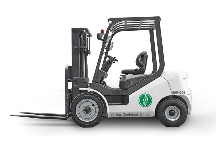
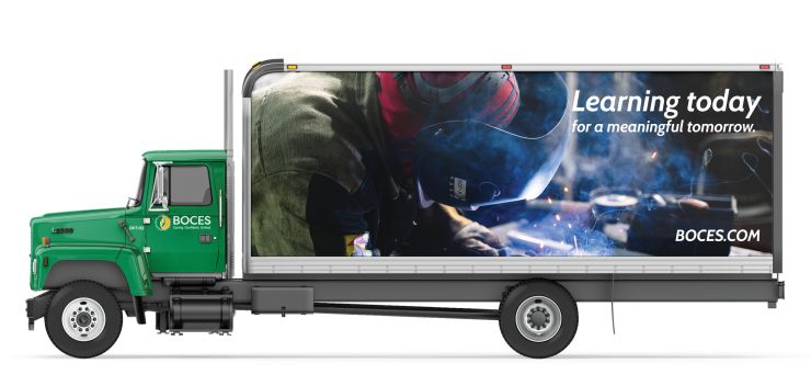
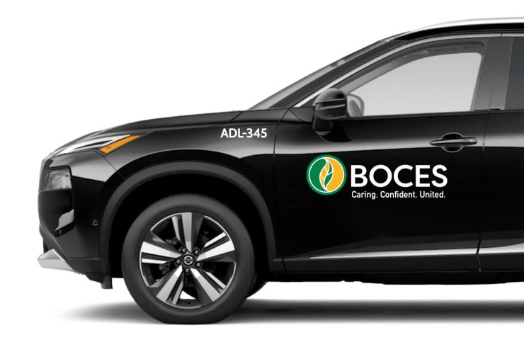
With more than 500 employees across 5 counties and dozens of locations including their two primary campuses, BOCES has direct and indirect interactions with a very large population who will interact with the brand and the organization in many different ways. We included BOCES branded applications for their vehicle fleet including sedans, delivery vehicles and site equipment such as payloaders and forklifts.
Clarity in Communication
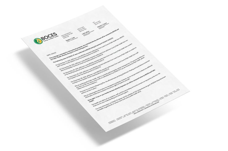
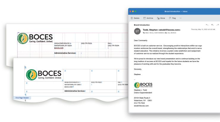
Like every modern organization, communication occurs in many forms to include print, digital and hybrid modalities. The same message must be delivered in both digital and analog forms. To accommodate this, a stationary system was created for these applications with templates for common tools such as InDesign, Word, and Outlook.
Growing Brand
Since the new program has been launched, the BOCES Communications department has created hundreds of assets and events that support a consistent application of the visual program. Ongoing initiatives and new processes are fostering greater thoughtfulness, communication and cohesiveness throughout the BOCES universe, reinforcing the organization’s new personality: Caring. Confident. United.
Related Work

Investor and community communications materials for startup incubator focused on unmanned vehicle industry.

Rename and brand strategy and execution for regional health provider.

When presentations become stories, not just charts and graphs, they evolve into transformative experiences.

Naming, Brand Strategy, Brand identity, content development and website for national healthcare consultant.