We create brands for exceptional companies.
76West creates brand strategy, positioning, and platform solutions built through close collaboration and shaped by long-term vision. Our work delivers clarity, cohesion, and creative alignment—giving organizations and their teams a brand they can stand behind. This is the kind of thinking that moves brands forward.
DITTO
Strategy, identity and communication for luxury property development company in Washington, DC.
BOCES
Research, strategy, identity and communication for regional co-operative education services provider.
O'Connell More Consulting and Real Estate
Brand identity, content development, website and marketing strategy for commercial real estate brokerage company.
Microscope
Naming, Brand Strategy, Brand identity, content development and website for national healthcare consultant.
Circare
Rename and brand strategy and execution for regional health provider.
Worldcrypto News
Brand identity, and website for cryptocurrency news outlet.
AXNT Direct Email
Brand identity, content development and website redesign for mid-tier email marketing provider.
Fust Charles Chambers
Content strategy and identity update for regional accounting firm.
BioportUSA
Strategic brand Identity for international med-tech market entry firm.
Seneca Savings
Brand platform and identity system for regional savings and loan bank.
Portland Labs
Website UX/UI, content development and marketing platform for a secure multi-site CMS platform.
Genius NY
Investor and community communications materials for startup incubator focused on unmanned vehicle industry.
International Climbing Machines
Product and capabilities communications materials for robotics inspection company.
Jerash Garments
Website content development and user interface for corporate IPO.
AACT Jobs
Identity, Advertising and Website for career training program
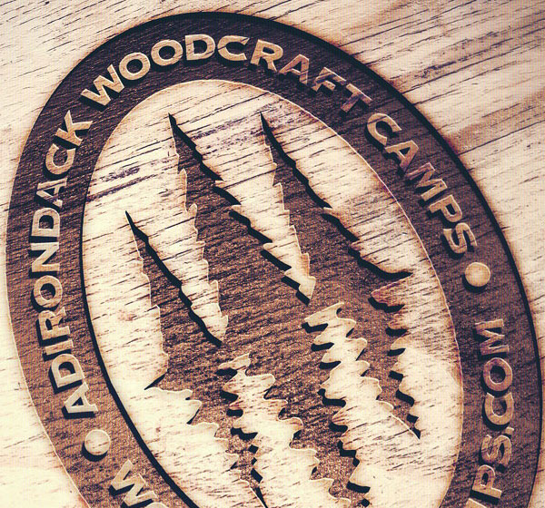
Adirondack Woodcraft Camps
Comprehensive rebrand program that builds on legacy, heritage and the camper spirit for a historic Adirondack summer camp.
NYSERNet
A human identity for a ground breaking research network organization.
Junior Achievement
When presentations become stories, not just charts and graphs, they evolve into transformative experiences.


